
In a world where our homes and styles are constantly evolving, neutral paint colors are often the answer to flexible color options. The problem is that there are hundreds of neutral paint colors, so which ones are best for your project? Today we're breaking down some of the vital differences in these colors and sharing some of our absolute favorites!

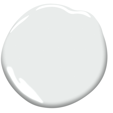
Wall: Benjamin Moore Simple White Trim: Benjamin Moore White Heron
- Undertone - The undertone of a color is crucial for it looking appropriate in your project. Common undertones to light, neutral colors are blue, green and yellow. Blue tends to make colors appear a little cooler. Green can have a bit of a softer affect (due to it's yellow components) and yellow can make a color skew warm and sometimes a little blah. If you're not sure, compare the neutral shade to blues, greens and yellows. Holding them up together will help you identify it's comprised of.
- Saturation - One of the best things about a neutral color is that it gives just enough personality to the walls, without overdoing it. The saturation of a color can usually be an indicator of how neutral they are. The less saturated, typically the more neutral. Just a hint of color can be subtle. However, keep in mind that some colors can appear fairly saturated but aren't as heavy once they're on the wall. Benjamin Moore's Revere Pewter and Gray Owl are two examples of these.
- Pairings - All colors, but certainly neutral colors, can be heavily impacted by the colors that are with them. Colors can bring out the undertones of a neutral, making them skew a little more heavily in the right or wrong direction. Hold up some color samples next to your neutral to make sure it's right for you.
- Lighting - The lighting of a space is another crucial factor in selecting your paint color. Make sure you put a sample in the room and see how it changes color throughout the day. You want to make sure you're comfortable with all the variations of a shade before you commit. The lighting can also play a role in how the color presents on the walls - playing up the undertones or making it appear darker/lighter than you originally thought.
Below are our favorite neutral colors to incorporate into projects. They are all Benjamin Moore paint colors, our paint vendor of choice.